(2026 color of the year from Sherwin-Williams, Benjamin Moore, Behr, Valspar, and Farrow & Ball)
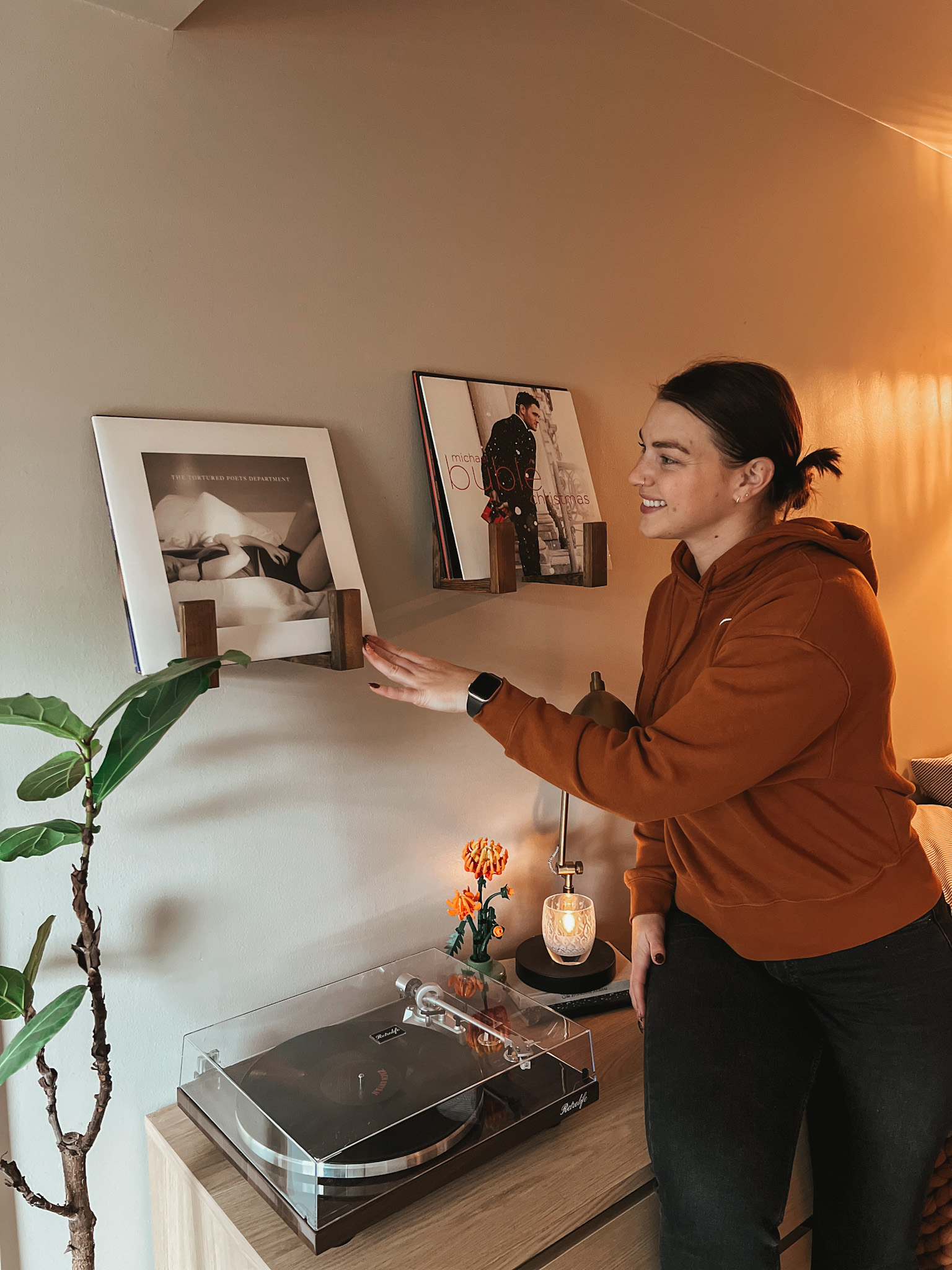
Looking to bring a little more personality into your home this year? Bold paint doesn’t have to mean chaotic or overwhelming. When you choose the right combinations, you can add depth, contrast, and fresh energy without committing to anything that will feel dated next season. These five trend-forward palettes are a perfect place to start- they’re modern, elevated, and new for 2026!
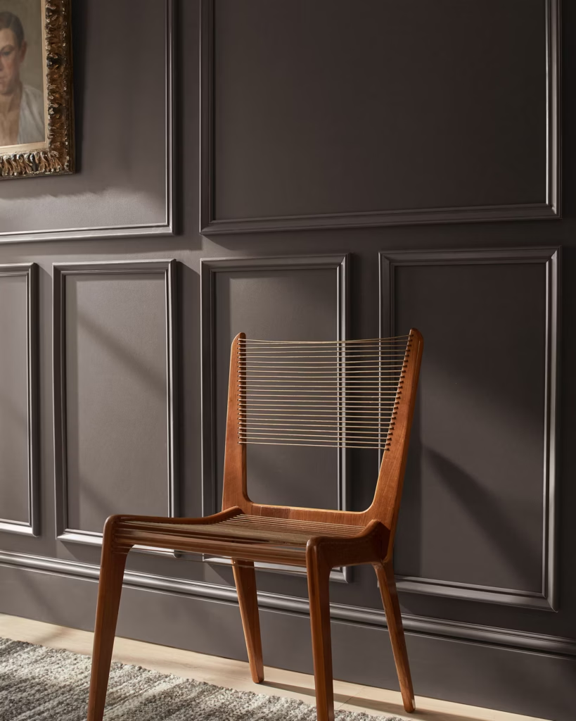
1. Moody Sophistication
A rich mix of soft plum, moody charcoal, and a warm creamy neutral. This palette feels elevated and dramatic without leaning overly dark. If you want a bold-but-livable update, this trio adds instant depth and coziness.

Paint Colors
- Silhouette — Benjamin Moore
- Carter Plum — Benjamin Moore
- White Dove — Benjamin Moore
Where This Palette Works Best
- Living rooms where you want warmth + drama
- Bedrooms for a moody retreat
- Office or reading nooks
Styling Tips
- Pair aged brass or antique gold hardware with Carter Plum to enrich the color without making it too bold.
- Combine cognac leather, dark walnuts, or rich wood tones for warmth.
- Layer in cream or taupe textiles (throw blankets, bouclé accents) to balance the deeper tones.
- Add a few matte black decor pieces for contrast and cohesion.
2. Modern Coastal
Relaxed but refined, this palette blends a soft khaki, a deep navy, and a warm white for a coastal look that feels fresh instead of beach-themed. It’s the perfect 2026 update for anyone who loves neutrals but wants a little more depth.

Paint Colors
- Universal Khaki — Sherwin-Williams
- Naval — Sherwin-Williams
- White Snow — Sherwin-Williams
Where This Palette Works Best
- Living rooms or family rooms
- Bathrooms for a “spa coastal” vibe
Styling Tips
- Use warm woods (oak, walnut, ash) to emphasize the organic feel.
- Layer in oatmeal linens, jute, and soft knits to keep the palette cozy.
- Incorporate brushed nickel or soft brass depending on whether you want coastal-light or coastal-elegant.
- Add subtle blue-gray artwork to tie the palette together without overwhelming it.

3. Soft Rustic
Warm, earthy, and timeless, this palette blends terracotta-inspired tones with soft neutrals for a rustic-meets-elevated look. Perfect for homes that embrace natural materials and a calming, grounded atmosphere.

Paint Colors
- Marmelo — Farrow & Ball
- Joa’s White — Farrow & Ball
- Jitney — Farrow & Ball —
Where This Palette Works Best
- Kitchens (Marmelo cabinetry is stunning)
- Hallways or mudrooms where you want personality
- Bedrooms in need of a soft-but-earthy refresh
Styling Tips
- Bring in medium-to-dark woods like walnut, mahogany, or reclaimed oak.
- Use natural fabrics like washed linen, textured cotton, and bouclé in off-white or oatmeal.
- Incorporate stone or ceramic accents (travertine, limestone, handmade pottery) to echo the rustic warmth.
- Keep décor matte rather than glossy for a natural finish.

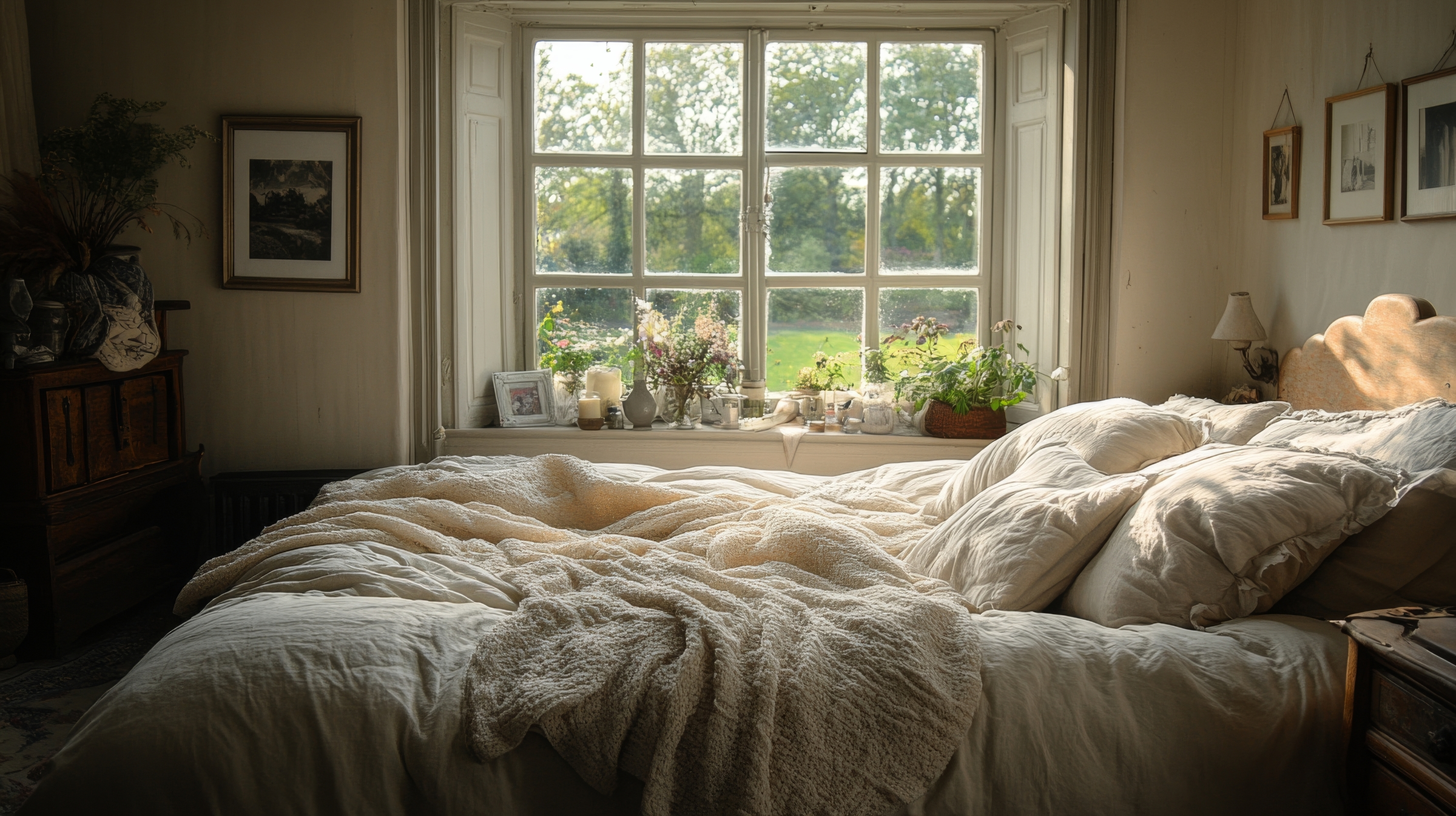
4. Modern Sanctuary
A calming, restorative palette built around soft greens and warm neutrals. This combination leans peaceful and grounded, perfect for creating spaces that feel like a reset.

Paint Colors
- Hidden Gem — Behr
- Mocha Ice — Behr
- Blank Canvas — Behr
Where This Palette Works Best
- Bedrooms for the ultimate quiet retreat
- Bathrooms or powder rooms
- Home offices where you want focus without starkness
- Pantries or laundry rooms for a refreshing hint of color
Styling Tips
- Combine velvet, bouclé, and soft woven fabrics to add texture and warmth.
- Accent with champagne bronze, brushed brass, or copper to enhance the warm undertones.
- Use light-toned wood (white oak, sienna maple) to keep the palette bright.
- Add greenery! This palette is extremely biophilic and thrives with plants.

5. Biophilic Balance
Inspired by nature and softened with nostalgic undertones, this palette blends muted greens and warm neutrals for a grounded, serene atmosphere. It feels timeless but still modern. It’s perfect for adding warmth without overwhelming a space.

Paint Colors
- Warm Eucalyptus — Valspar
- Degas Blue — Valspar
- Groundbreaking — Valspar
Where This Palette Works Best
- Bedrooms for a soothing retreat
- Living rooms with lots of natural light
Styling Tips
- Pair with walnut or cherry wood to enhance the warmth of the palette.
- Use washed linens, bouclé, and velvet to create a layered, calming feel.
- Add aged brass or antique gold hardware to bring out the muted warmth.
- Incorporate ceramic pottery and woven textures for a natural, organic finish.

Final Thoughts
2026 is the year of bold-but-beautiful color. Whether you’re repainting a whole room or just refreshing thrifted furniture, these palettes let you play with color without committing to anything overwhelming and arm you with color combos that you know will work well together.
Follow me on Instagram at tarahillhome for more design content!

Leave a Reply